Verification for AI-Generated Artifacts
Making it clear whether AI-generated work can be trusted, and what to do when it can’t.
Role
Lead product designer
Timeline
Jun - Sept 2026
Company
Summation
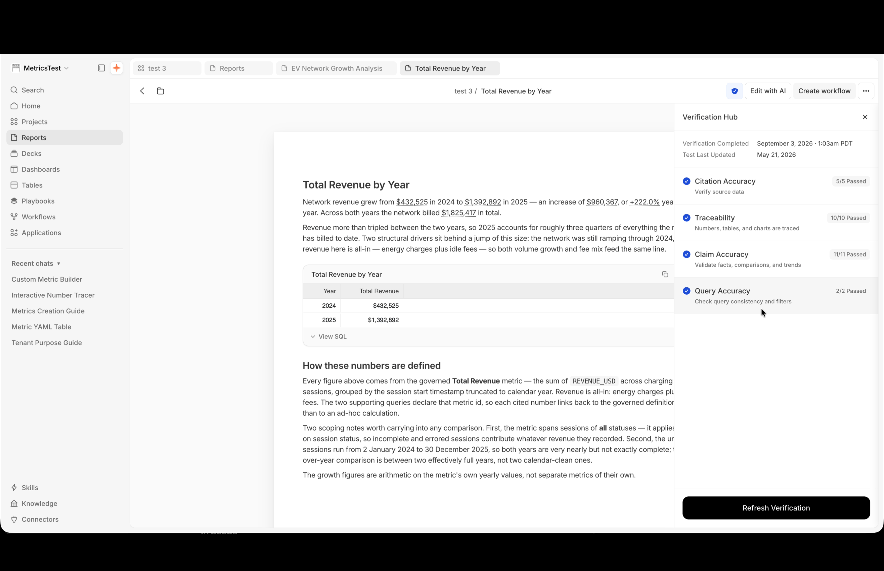


Made AI-generated work trustworthy at a glance, with the proof one click deeper.

Overview
Challenge
- Verification was Summation's main selling point, but the "Verified" label had nothing behind it: no way to see what was checked, or whether it mattered.
- Hundreds of checks sit behind each report, but people only saw category totals like "Traces 17/17 passed."
Strategy
- One shield in the toolbar, with the detail in a side panel beside the artifact.
- Designed for the most common result, a partial pass, with a way to review and approve false alarms.
- Built the flow as a coded prototype, then closed the build gap myself.
Impact
- Untraceable report numbers fell from roughly 40% to under 1% after launch.
- 200+ checks per report, readable in one panel.
- Prototype and handoff in 11 days, on my first project at Summation
Product Strategy & Insights
The Starting Point
A “Verified” label you couldn’t dig into
The nav offered a “Verify” button on a document that already said “Verified,” and there was no way to dig into what the label meant.
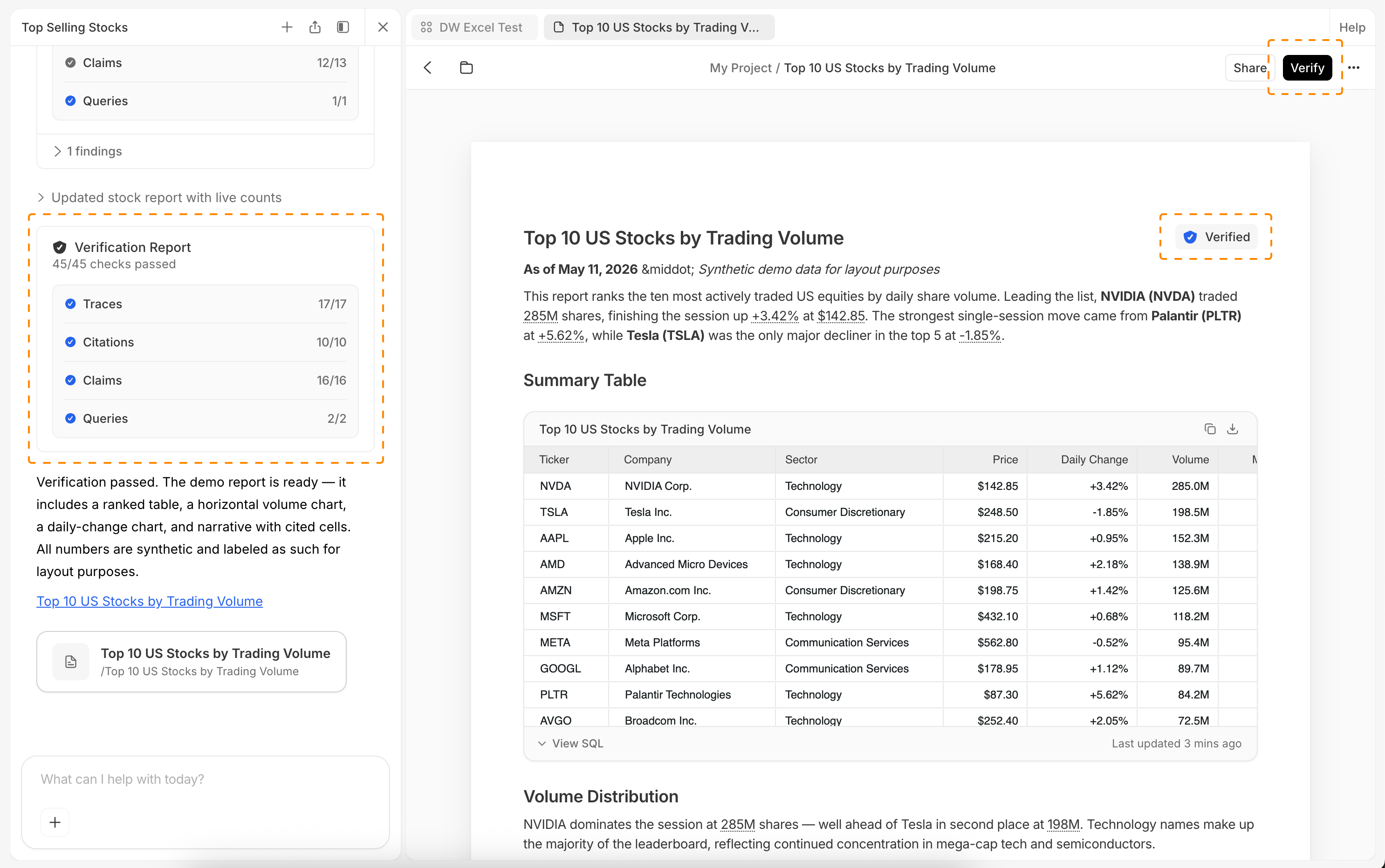
Before
User Research
Customers saw the label and ignored it
The old card only showed category totals, like "Traces 17/17 passed," never the tests behind them. The deployment team, who onboarded customers and were my link to them, said the label raised questions and people ignored it.
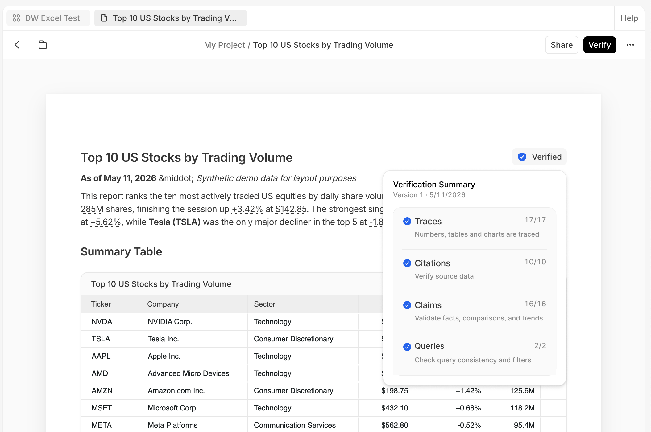
Old Verification Card
Design Challenge
Designing for hundreds of tests
The brief called for about 20 categories with 200 tests each, across every artifact type. I mapped every state, what the user sees and what’s happening behind it, to decide what belongs up front and what goes deeper.
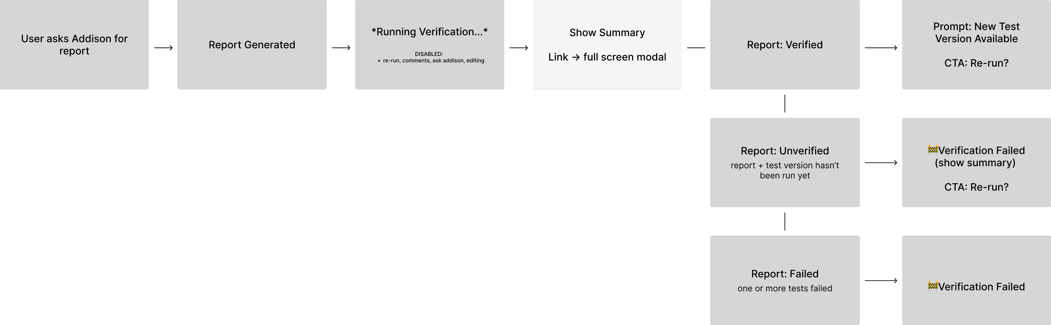
Design Process & Decisions
Key Decision #1
Show the tests, not just the totals
The old card gave category totals and no tests. A side panel lists every check right next to the report, with less room than a modal but no need to close what you're checking.
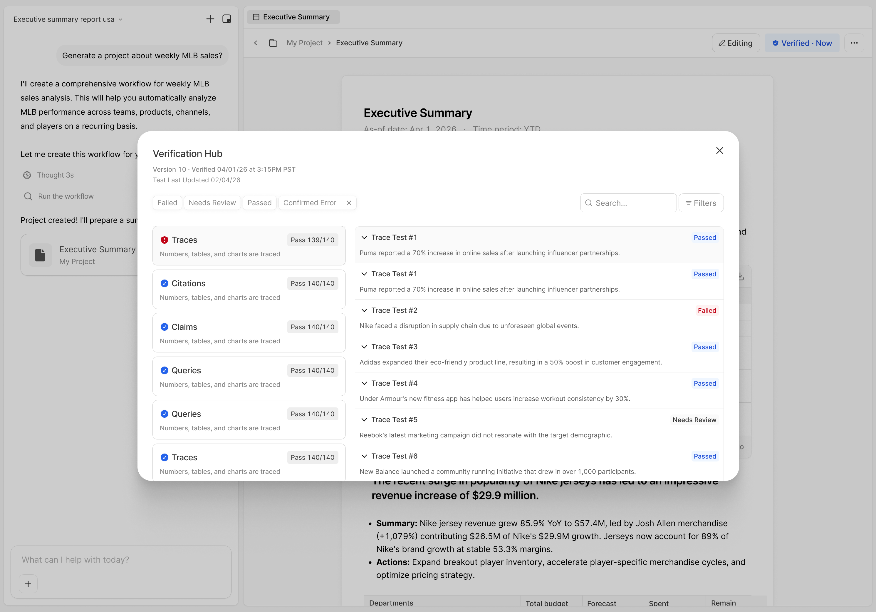
Explored a modal experience.
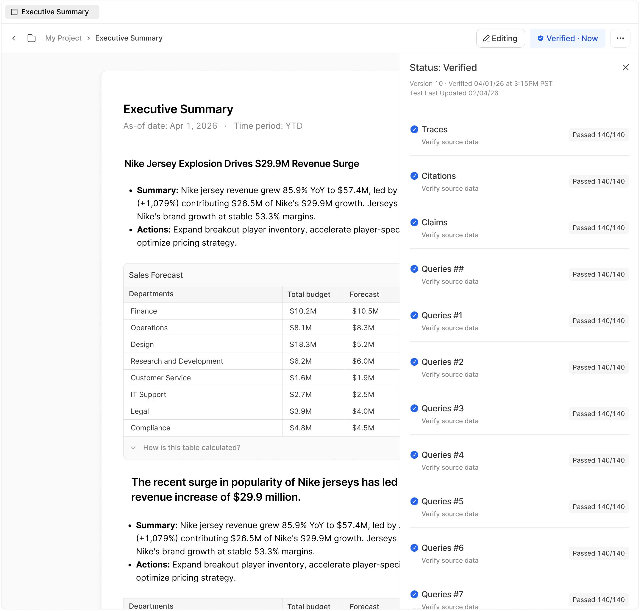
Decided: The modal covers the report you're checking but the panel doesn't.
Key Decision #2
Let an icon carry the status
The team split on “x of n passed” versus a badge. Color on a shield carries the status, a click opens the real tests behind it, and a light hover explains each state. It asks more of the viewer than a word, but scales to hundreds of tests.
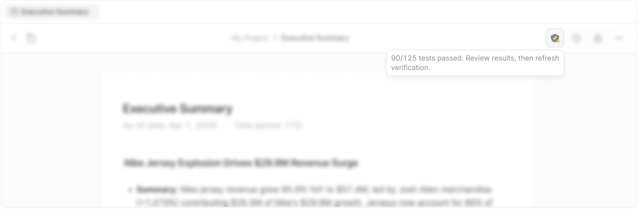
The badge shows the status.
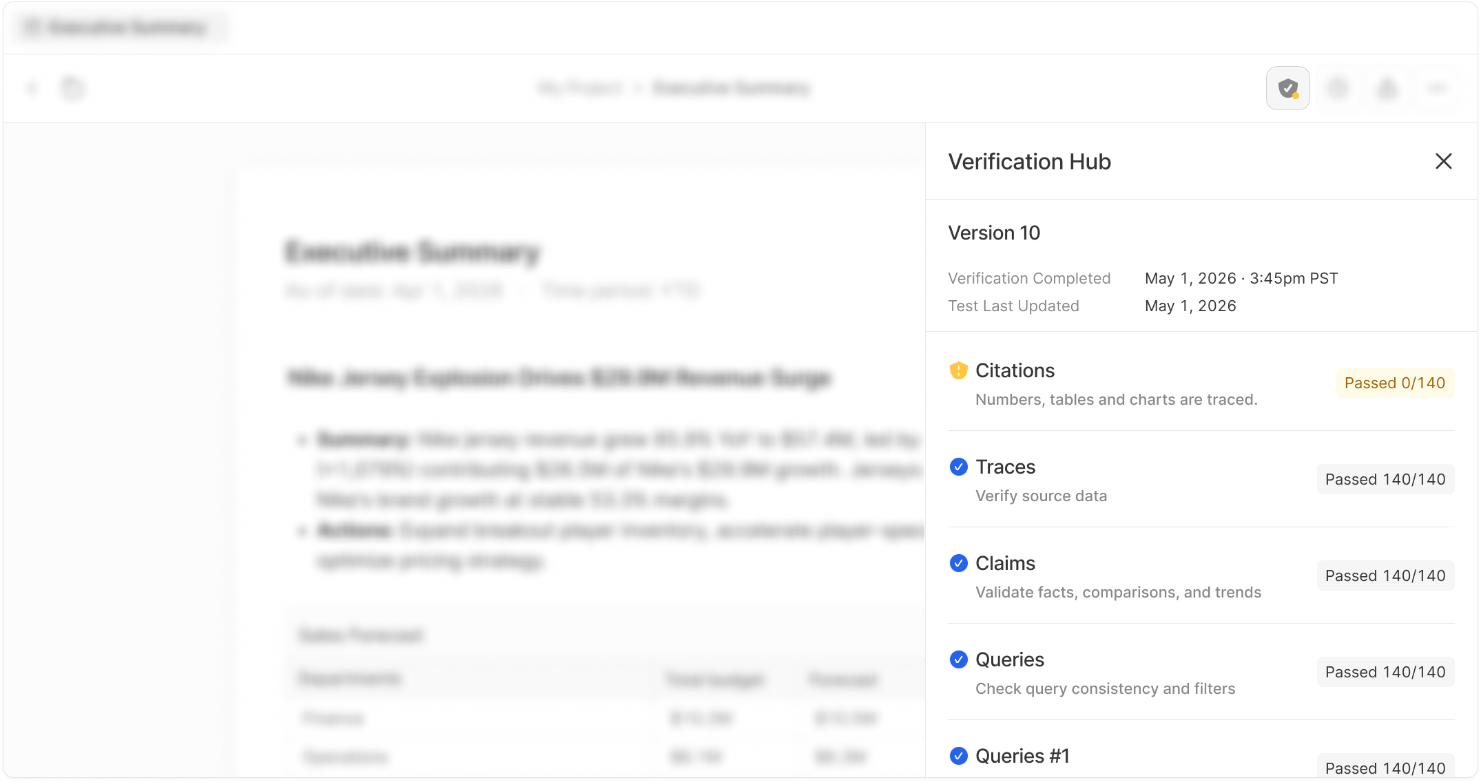
Tapping on the badge shows the tests behind it.
Key Decision #3
Design for the false alarm
AI isn't deterministic, so a failed check can pass on a re-run. Flagged items get Approve, sections get Approve all flagged, and Refresh verification is always in reach.
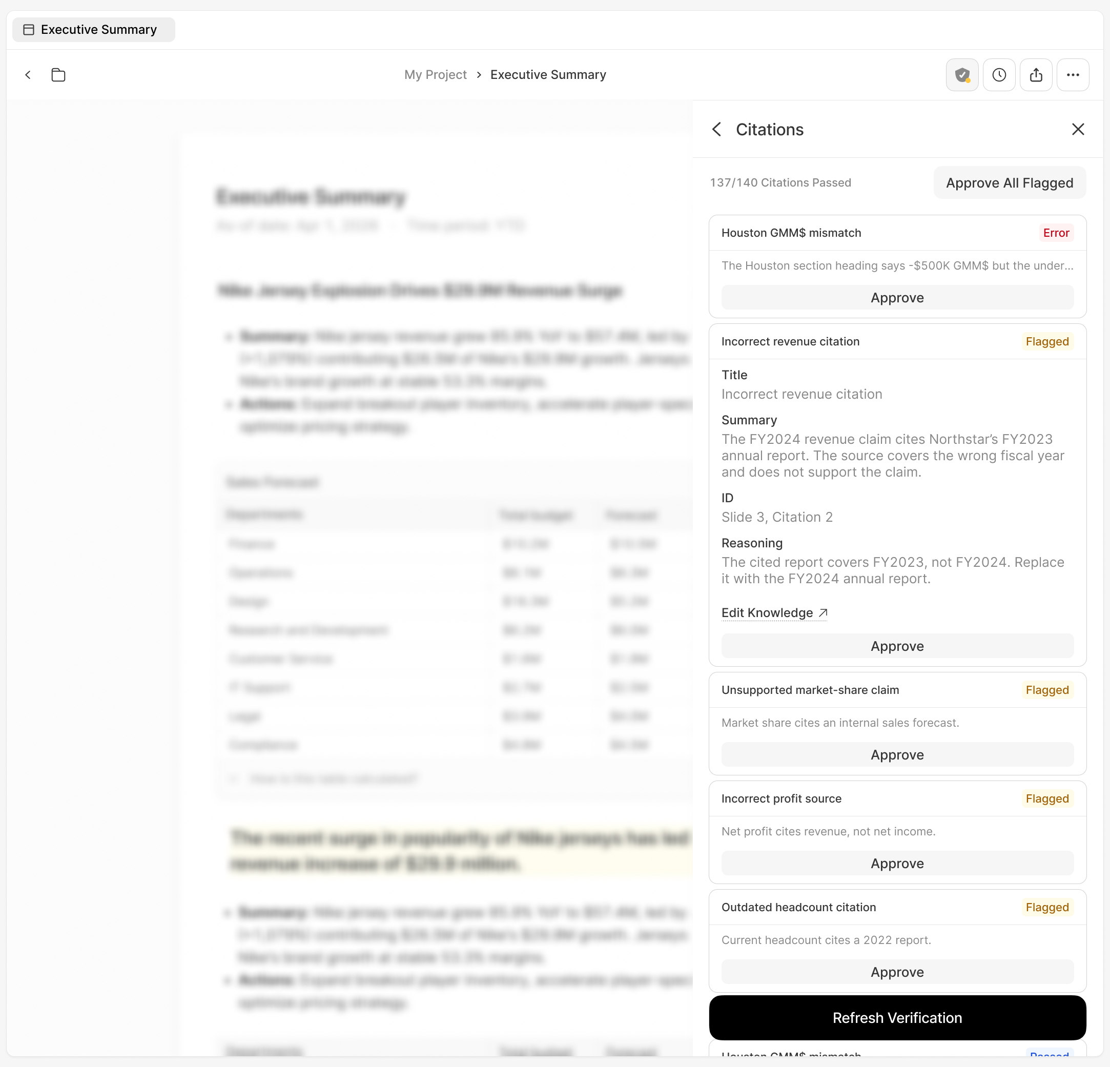
A failed check can be a false alarm, so people can approve it.
Key Decision #4
Cut version history to protect the launch
Version history overlapped with a parallel project and turned out to be a project of its own. The PM and I cut it, giving up a history view at launch so every state of the panel was fully designed.
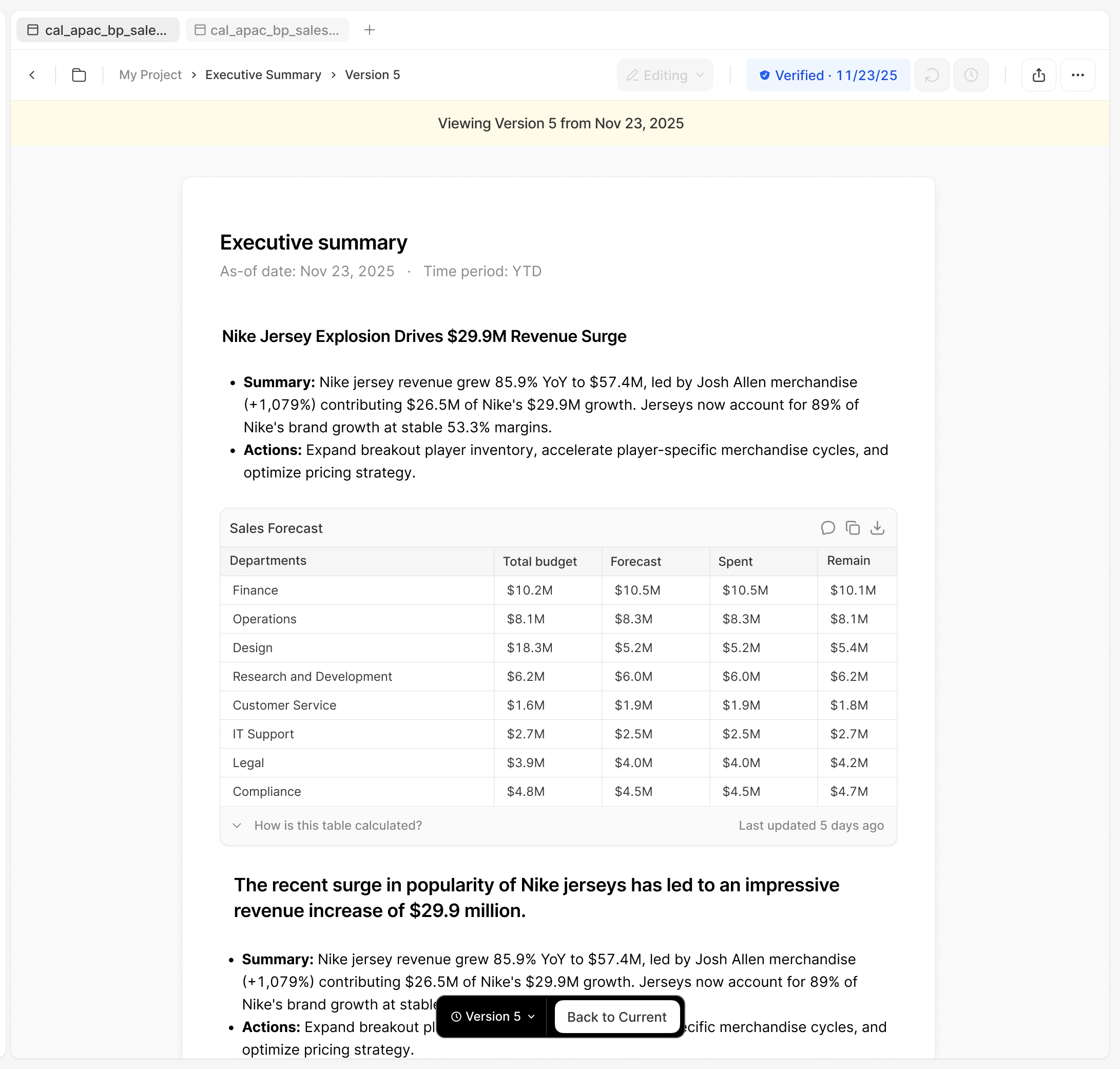
Version history was a project of its own, so we cut it.
Final Design
One shield, one panel, and a clear next step when an artifact passes, needs review or errors.


Outcomes
- Untraceable report numbers fell from 40% to under 1%
- 200+ automated checks per report, surfaced in a single panel.
- PRD to working prototype and handoff in 11 days, on my first project.
- Engineering built on my design, and I shipped the polish PR myself.
- Featured in the launch marketing video.
Reflections
Design for the wrong answer, too.
A verification that only handled "pass" would break the first time the AI got it wrong. Designing for flags and false alarms made the product feel more trustworthy.
AI is changing handoff, so agree on the process.
Coded prototypes are now part of how designers hand off. Even without a team-wide process, agree with the engineer you’re working with on how to use them at kickoff, not at the bug bash.
Other Projects

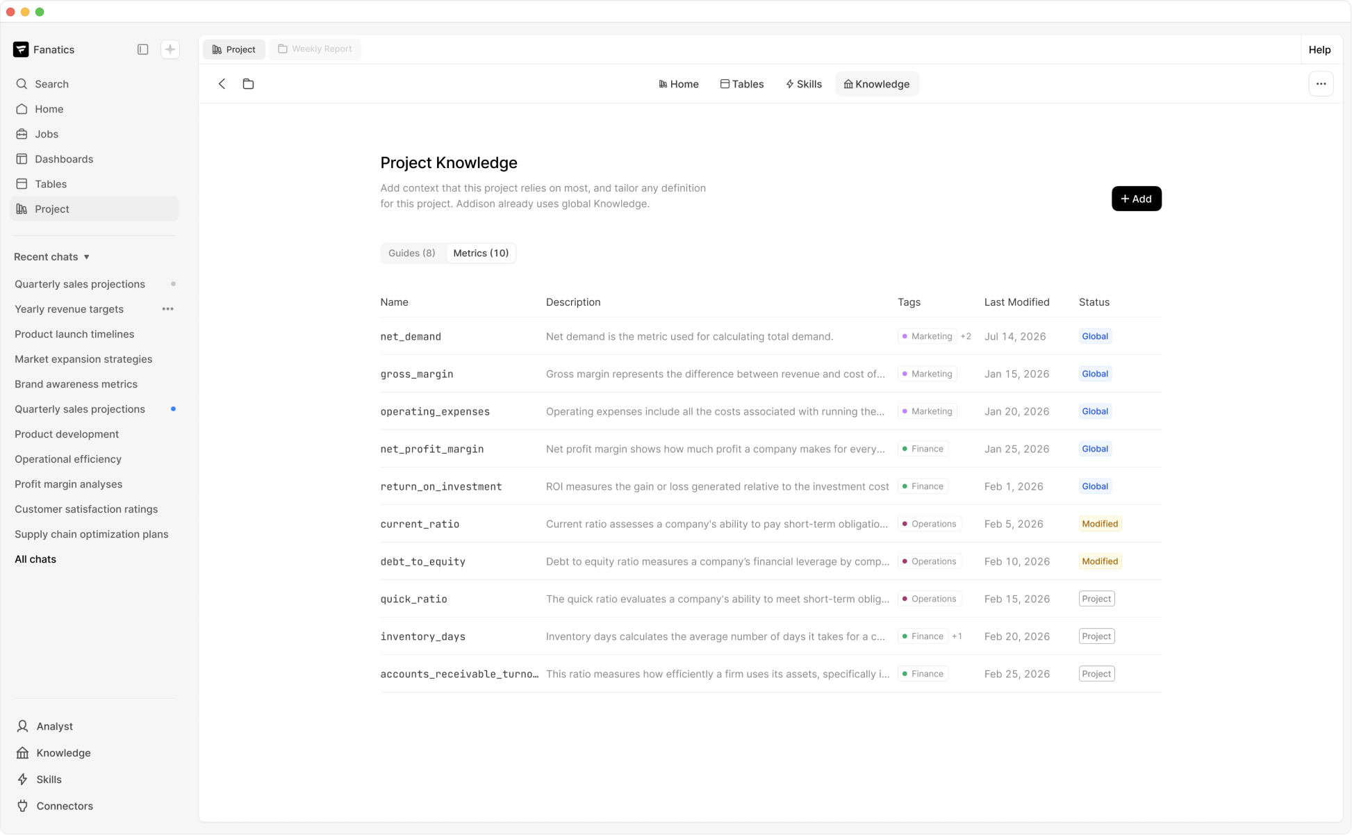
Knowledge Management for AI
→

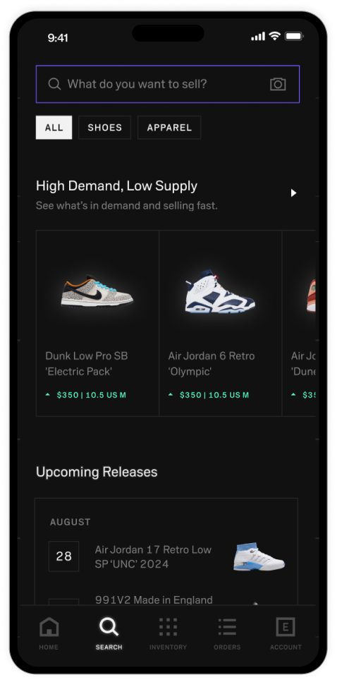
Search and Discovery Redesign
→

w
d
CONTACT
workudianne@gmail.com
SOCIAL
Verification for AI-Generated Artifacts
Making it clear whether AI-generated work can be trusted, and what to do when it can’t.
Role
Lead product designer
Timeline
Jun - Sept 2026
Company
Summation


Made AI-generated work trustworthy at a glance, with the proof one click deeper.

Overview
Challenge
- Verification was Summation's main selling point, but the "Verified" label had nothing behind it: no way to see what was checked, or whether it mattered.
- Hundreds of checks sit behind each report, but people only saw category totals like "Traces 17/17 passed."
Strategy
- One shield in the toolbar, with the detail in a side panel beside the artifact.
- Designed for the most common result, a partial pass, with a way to review and approve false alarms.
- Built the flow as a coded prototype, then closed the build gap myself.
Impact
- Untraceable report numbers fell from roughly 40% to under 1% after launch.
- 200+ checks per report, readable in one panel.
- Prototype and handoff in 11 days, on my first project at Summation

Product Strategy & Insights
The Starting Point
A “Verified” label you couldn’t dig into
The nav offered a “Verify” button on a document that already said “Verified,” and there was no way to dig into what the label meant.
Before
User Research
Customers saw the label and ignored it
The old card only showed category totals, like "Traces 17/17 passed," never the tests behind them. The deployment team, who onboarded customers and were my link to them, said the label raised questions and people ignored it.
Old Verification Card
Design Challenge
Designing for hundreds of tests
The brief called for about 20 categories with 200 tests each, across every artifact type. I mapped every state, what the user sees and what’s happening behind it, to decide what belongs up front and what goes deeper.
Design Process & Decisions
Key Decision #1
Show the tests, not just the totals
The old card gave category totals and no tests. A side panel lists every check right next to the report, with less room than a modal but no need to close what you're checking.
Explored a modal experience.
Decided: The modal covers the report you're checking but the panel doesn't.
Key Decision #2
Let an icon carry the status
The team split on “x of n passed” versus a badge. Color on a shield carries the status, a click opens the real tests behind it, and a light hover explains each state. It asks more of the viewer than a word, but scales to hundreds of tests.
The badge shows the status.
Tapping on the badge shows the tests behind it.
Key Decision #3
Design for the false alarm
AI isn't deterministic, so a failed check can pass on a re-run. Flagged items get Approve, sections get Approve all flagged, and Refresh verification is always in reach.
A failed check can be a false alarm, so people can approve it.
Key Decision #4
Cut version history to protect the launch
Version history overlapped with a parallel project and turned out to be a project of its own. The PM and I cut it, giving up a history view at launch so every state of the panel was fully designed.
Version history was a project of its own, so we cut it.
Final Design
One shield, one panel, and a clear next step when an artifact passes, needs review or errors.


Outcomes
- Untraceable report numbers fell from 40% to under 1%
- 200+ automated checks per report, surfaced in a single panel.
- PRD to working prototype and handoff in 11 days, on my first project.
- Engineering built on my design, and I shipped the polish PR myself.
- Featured in the launch marketing video.
Reflections
Design for the wrong answer, too.
A verification that only handled "pass" would break the first time the AI got it wrong. Designing for flags and false alarms made the product feel more trustworthy.
AI is changing handoff, so agree on the process.
Coded prototypes are now part of how designers hand off. Even without a team-wide process, agree with the engineer you’re working with on how to use them at kickoff, not at the bug bash.
Other Projects
Knowledge Management for AI
→
Search and Discovery Redesign
→

w
d
CONTACT
workudianne@gmail.com
SOCIAL
Verification for AI-Generated Artifacts
Making it clear whether AI-generated work can be trusted, and what to do when it can’t.
Role
Lead product designer
Timeline
Apr - Jun 2026
Company
Summation
Made AI-generated work trustworthy at a glance, with the proof one click deeper.

Overview
Challenge
- Verification was Summation's main selling point, but the "Verified" label had nothing behind it: no way to see what was checked, or whether it mattered.
- Hundreds of checks sit behind each report, but people only saw category totals like "Traces 17/17 passed."
Strategy
- One shield in the toolbar, with the detail in a side panel beside the artifact.
- Designed for the most common result, a partial pass, with a way to review and approve false alarms.
- Built the flow as a coded prototype, then closed the build gap myself.
Impact
- Untraceable report numbers fell from roughly 40% to under 1% after launch.
- 200+ checks per report, readable in one panel.
- Prototype and handoff in 11 days, on my first project at Summation

Product Strategy & Insights
The Starting Point
A “Verified” label you couldn’t dig into
The nav offered a “Verify” button on a document that already said “Verified,” and there was no way to dig into what the label meant.
Before
User Research
Customers saw the label and ignored it
The old card only showed category totals, like "Traces 17/17 passed," never the tests behind them. The deployment team, who onboarded customers and were my link to them, said the label raised questions and people ignored it.
Old Verification Card
Design Challenge
Designing for hundreds of tests
The brief called for about 20 categories with 200 tests each, across every artifact type. I mapped every state, what the user sees and what’s happening behind it, to decide what belongs up front and what goes deeper.
Design Process & Decisions
Key Decision #1
Show the tests, not just the totals
The old card gave category totals and no tests. A side panel lists every check right next to the report, with less room than a modal but no need to close what you're checking.
Explored a modal experience.
Decided: The modal covers the report you're checking but the panel doesn't.
Key Decision #2
Let an icon carry the status
The team split on “x of n passed” versus a badge. Color on a shield carries the status, a click opens the real tests behind it, and a light hover explains each state. It asks more of the viewer than a word, but scales to hundreds of tests.
The badge shows the status.
Tapping on the badge shows the tests behind it.
Key Decision #3
Design for the false alarm
AI isn't deterministic, so a failed check can pass on a re-run. Flagged items get Approve, sections get Approve all flagged, and Refresh verification is always in reach.
A failed check can be a false alarm, so people can approve it.
Key Decision #4
Cut version history to protect the launch
Version history overlapped with a parallel project and turned out to be a project of its own. The PM and I cut it, giving up a history view at launch so every state of the panel was fully designed.
Version history was a project of its own, so we cut it.
Final Design
One shield, one panel, and a clear next step when an artifact passes, needs review or errors.


Outcomes
- Untraceable report numbers fell from 40% to under 1%
- 200+ automated checks per report, surfaced in a single panel.
- PRD to working prototype and handoff in 11 days, on my first project.
- Engineering built on my design, and I shipped the polish PR myself.
- Featured in the launch marketing video.
Reflections
Design for the wrong answer too.
A verification that only handled "pass" would break the first time the AI got it wrong. Designing for flags and false alarms made the product feel more trustworthy.
AI is changing handoff, so agree on the process.
Coded prototypes are now part of how designers hand off. Even without a team-wide process, agree with the engineer you’re working with on how to use them at kickoff, not at the bug bash.
Other Projects
Knowledge Management for AI
→

Search and Discovery Redesign
→

w
d
CONTACT
workudianne@gmail.com
SOCIAL