Knowledge Management for AI
Designing how enterprise teams define, share and govern the metrics, guides and key tables Summation's AI relies on.
Role
Lead product designer
Timeline
Jun - Sept 2026
Company
Summation
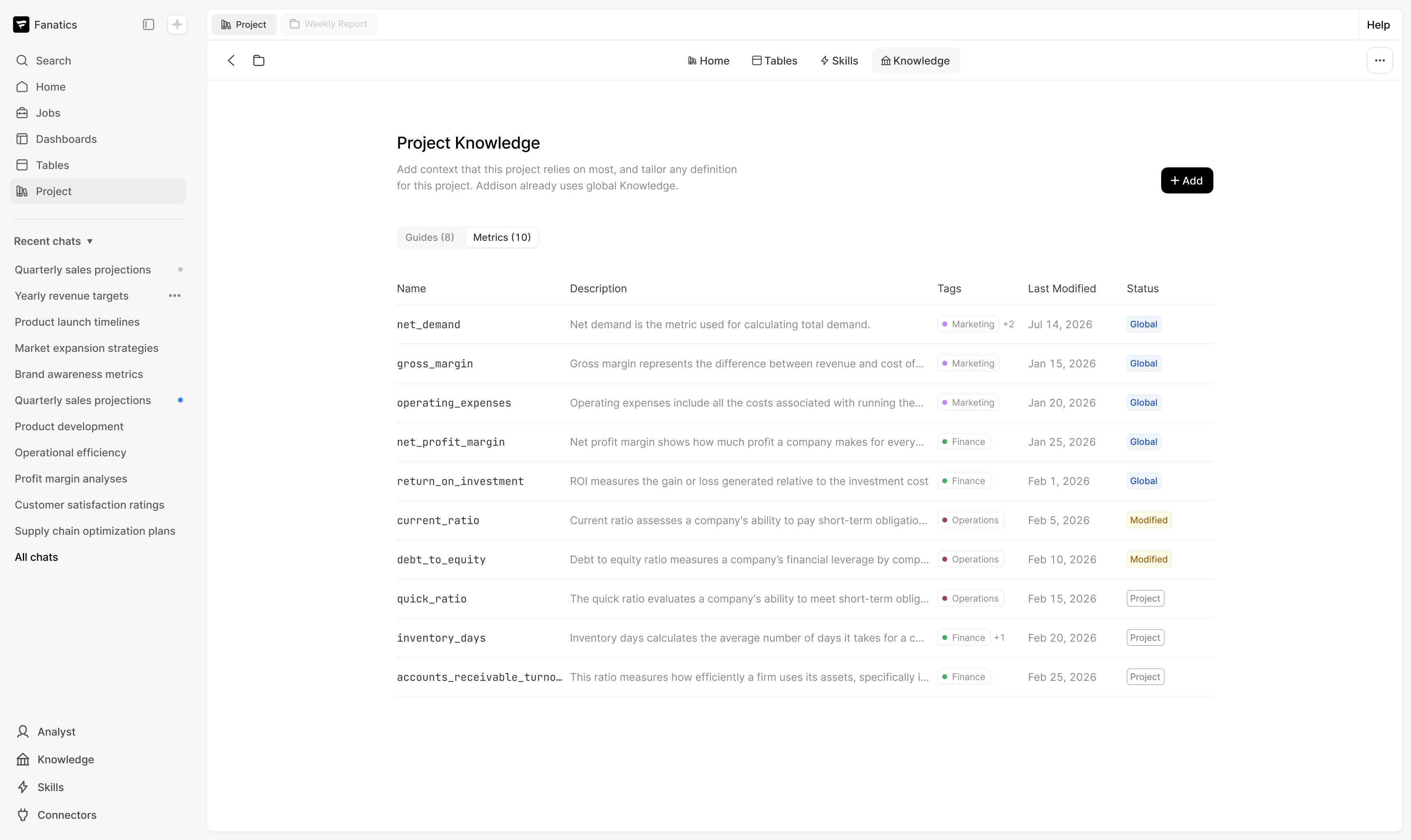


Gave enterprise teams a shared knowledge hub, so ~95% of AI report numbers are defined.

Overview
Challenge
- Knowledge was a loose folder of files, with no place for metrics at all.
- AI agents hallucinacted or guessed definitions, so report numbers didn't match their own.
Strategy
- Replaced per-team duplicates with one official metric projects can copy, modify and publish back.
- Designed for a state no one had planned: a company metric modified within a user’s project.
- Simple language for finance analysts, SQL one click deeper for data admins.
Impact
- 5 enterprise customers reused 50+ company metrics across 10+ projects.
- ~95% of report numbers trace to a defined metric, within 2 clicks of its source.
- 152 new workspaces in 2 weeks after launch; nearly 200 monthly active users.
Product Strategy & Insights
The Starting Point
Knowledge was buried in a folder of files
Knowledge is the AI's company handbook: metrics, guides and key tables. It lived in loose files with no place for metrics, so when a report said "Net Demand was $4.2M," no one could see or fix it.
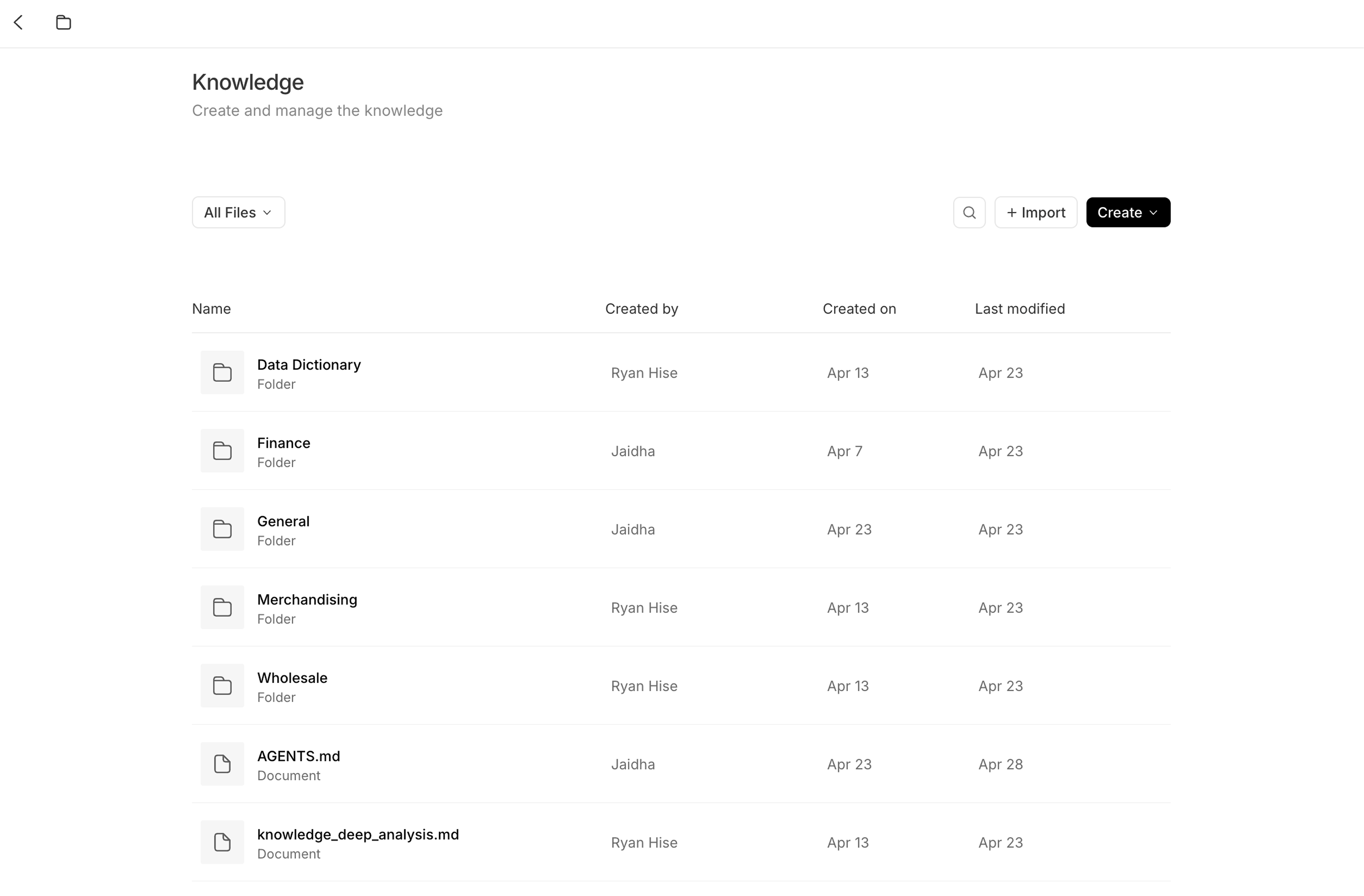
Before
Target Users
Built for the data admin and the finance analyst
Data admins write the SQL behind each metric; finance analysts just want to check a number. After watching an analyst hit a wall of SQL, I put plain language first and SQL one click deeper.
Competitive Research
Few good references existed, so I tested against real data
AI knowledge tools were new ground. I studied Databricks, Snowflake, Looker, Hex and others, then stress-tested layouts with real customer data, which led to tags and a list that scales.
Scope Creep
Three parts planned, two shipped
We started with metrics, the numbers customers dispute most. When a human-approval step was cut for resources, I kept a metric activity log and let teams publish directly to move faster.
How I Worked
Explore with AI, decide in Figma, ship in code
Reviewed the previous design handoff to understand existing constraints and familiarity requirements.
Studied image-heavy UI patterns to improve hierarchy, photo usage, and scannability in a dense interface.
Design Process & Decisions
Key Decision #1
From team "domains" to one shared source of truth
My early mockups organized knowledge by department. Leaders pushed back since metrics would duplicate across teams, so we landed on one official version per metric that projects can copy and adapt.
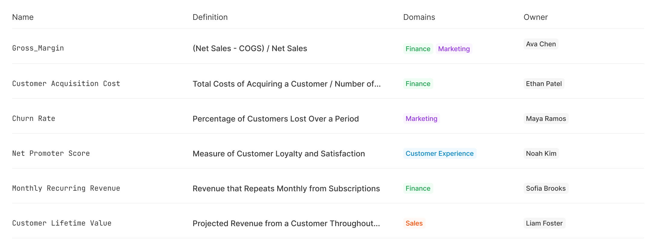
Early concept: knowledge grouped by domains, so every team kept its own copy of the same metric.
Shipped: one list of company metrics, each labeled with where it comes from (global, modified from global, or net new from project).
Key Decision #2
Make metrics & guides distinct, but consistent
Metrics and guides needed to feel distinct. I explored bolder layouts, like a dense code-style list and a wide table, but we chose consistency; standard list with metric names in a code font.
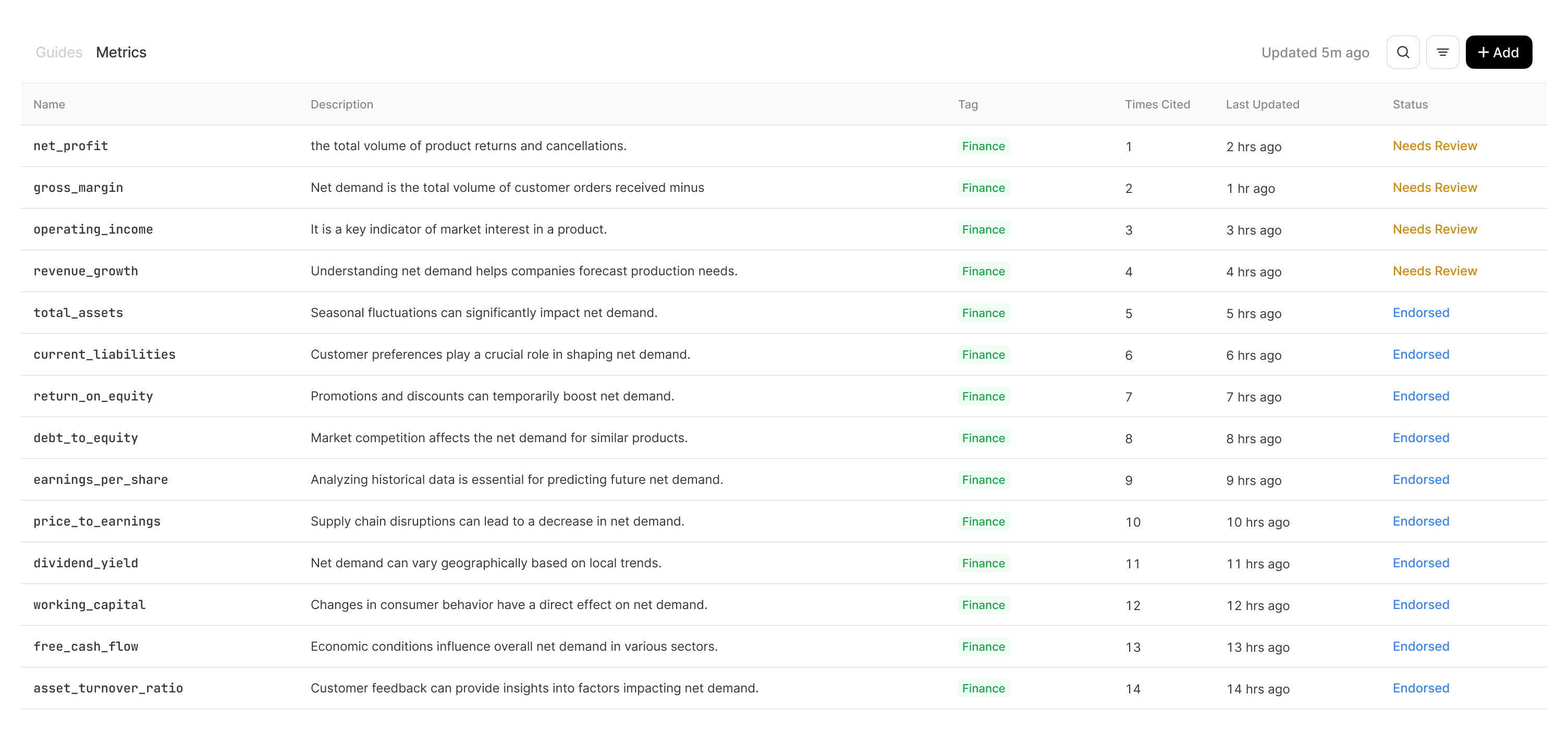
Explored: dense lists and wide tables

Shipped: standard list, metrics names in a code style font.
Key Decision #3
Give project knowledge a home that scales
I explored two things. Entry point: a simple nav button beat a sidebar widget, keeping AI context apart from true settings. Container: a full page with a left side nav beat a large modal and top tabs, with room for tables and skills.
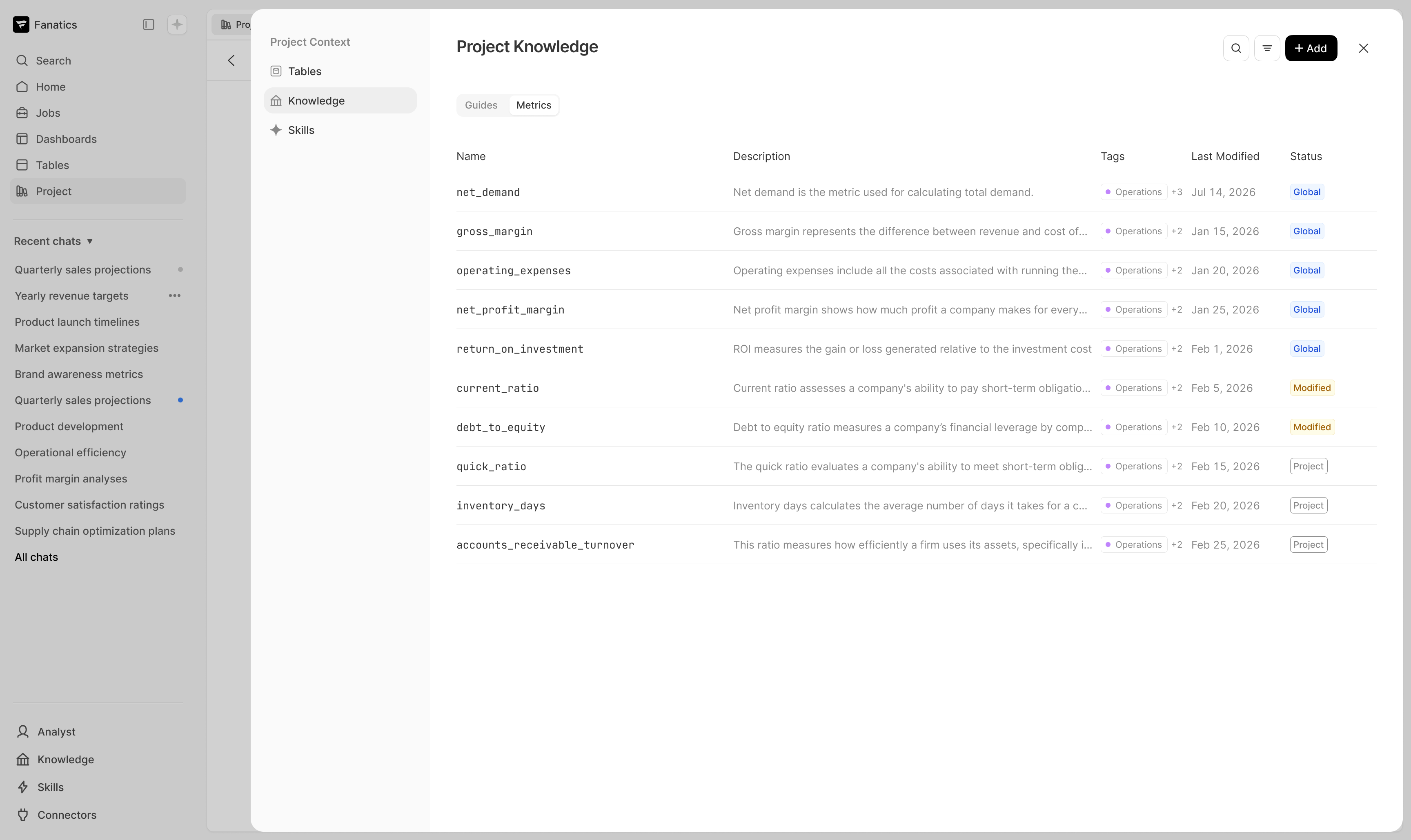
Explored: Knowledge settings within a modal surface
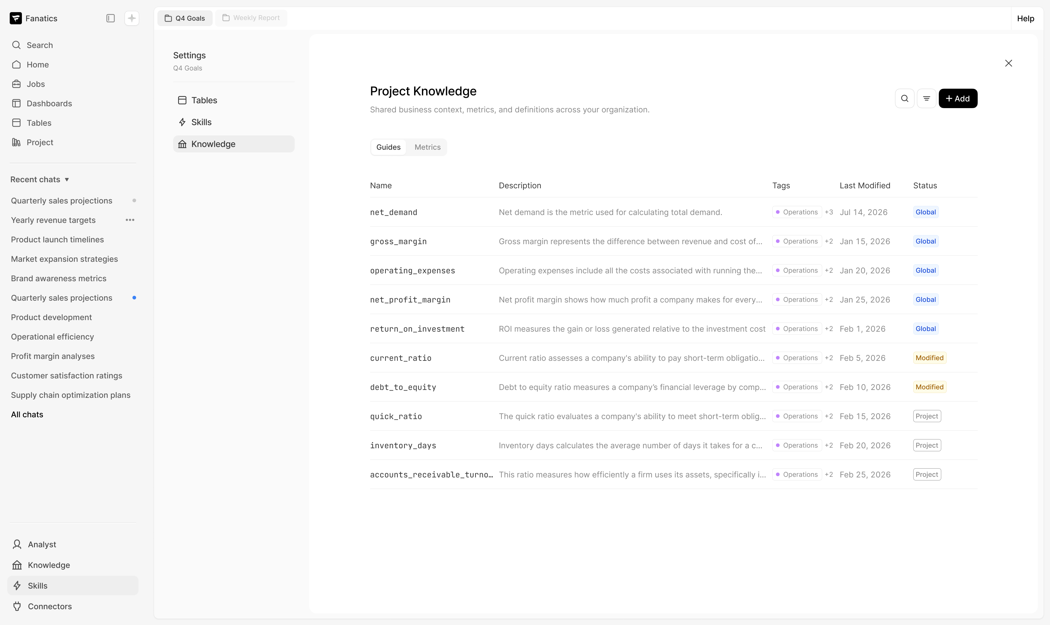
Chosen path: Full page for a bigger workspace
Key Decision #4
Make knowledge impossible to miss
Two days before launch, leadership flagged that Knowledge was hard to discover. I framed three navigation options with clear trade-offs, aligned the team on a center navigation and built it before launch.
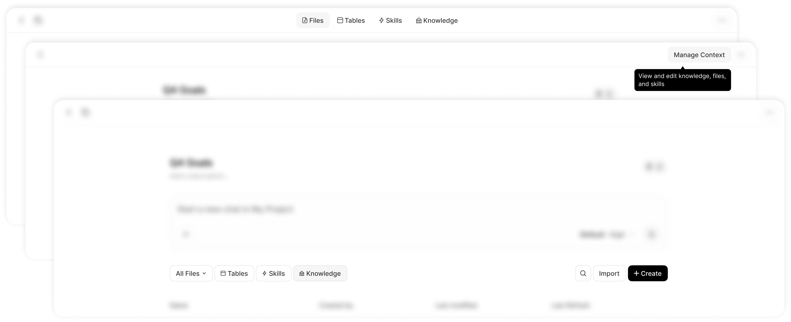
Various explorations to make knowledge more discoverable: top navigation, top-right button, and pills
Final Design
One place to define, adapt and share what the AI knows
Knowledge now sits beside project files, showing which metrics and guides are Global, Project or Modified. After bug bashes, I moved metric editing to a full page linked to its key table, built with Claude Code from our components.


Outcomes
- 5 enterprise customers reused 50+ company-wide metrics across 10+ projects.
- About 95% of report numbers come from a defined metric, each 2 clicks or fewer from its source.
- Shipped in the September launch: 152 new workspaces in 2 weeks, nearly 200 monthly active users.
- 7 front-end PRs shipped myself, from code prototype to launch-week fixes.
Reflections
A concrete wrong answer moves the team faster
My domain mockups didn't ship, but they got the strategy conversation moving. Putting something real in front of leadership early is more efficient than waiting for a finished brief.
What I'd do next
Next I'd build endorsement, where the AI drafts metrics and a person approves them, plus signals that show when knowledge changes, and conversational editing through the AI.
Other Projects


ML Powered Search Tool
→

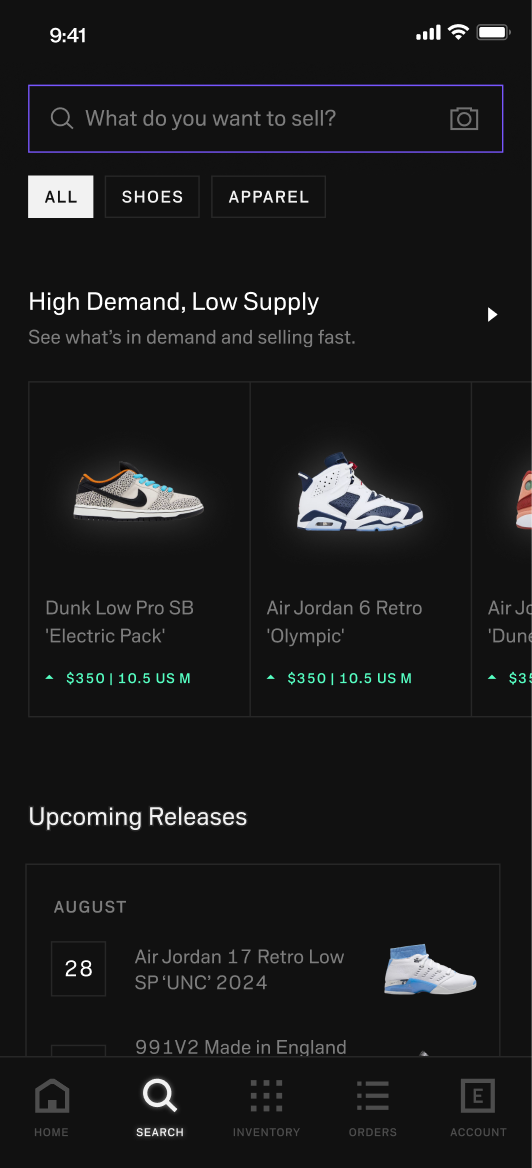

Search and Discovery Redesign
→

w
d
CONTACT
workudianne@gmail.com
SOCIAL
Knowledge Management for AI
Designing how enterprise teams define, share and govern the metrics, guides and key tables Summation's AI relies on.
Role
Lead product designer
Timeline
Jun - Sept 2026
Company
Summation


Gave enterprise teams a shared knowledge hub, so ~95% of AI report numbers are defined.

Overview
Challenge
- Knowledge was a loose folder of files, with no place for metrics at all.
- AI agents hallucinacted or guessed definitions, so report numbers didn't match their own.
Strategy
- Replaced per-team duplicates with one official metric projects can copy, modify and publish back.
- Designed for a state no one had planned: a company metric modified within a user’s project.
- Simple language for finance analysts, SQL one click deeper for data admins.
Impact
- 5 enterprise customers reused 50+ company metrics across 10+ projects.
- ~95% of report numbers trace to a defined metric, within 2 clicks of its source.
- 152 new workspaces in 2 weeks after launch; nearly 200 monthly active users.

Product Strategy & Insights
The Starting Point
Knowledge was buried in a folder of files
Knowledge is the AI's company handbook: metrics, guides and key tables. It lived in loose files with no place for metrics, so when a report said "Net Demand was $4.2M," no one could see or fix it.
Before
Target Users
Built for the data admin and the finance analyst
Data admins write the SQL behind each metric; finance analysts just want to check a number. After watching an analyst hit a wall of SQL, I put plain language first and SQL one click deeper.
Competitive Research
Few good references existed, so I tested against real data
AI knowledge tools were new ground. I studied Databricks, Snowflake, Looker, Hex and others, then stress-tested layouts with real customer data, which led to tags and a list that scales.
Scope Creep
Three parts planned, two shipped
We started with metrics, the numbers customers dispute most. When a human-approval step was cut for resources, I kept a metric activity log and let teams publish directly to move faster.
How I Worked
Explore with AI, decide in Figma, ship in code
I used Claude Code to spin up lo-fi options before committing in Figma, reviewed every round with leadership within days, and shipped 7 front-end PRs myself through launch.
Design Process & Decisions
Key Decision #1
From team "domains" to one shared source of truth
My early mockups organized knowledge by department. Leaders pushed back since metrics would duplicate across teams, so we landed on one official version per metric that projects can copy and adapt.
Early concept: knowledge grouped by domains, so every team kept its own copy of the same metric.
Shipped: one list of company metrics, each labeled with where it comes from (global, modified from global, or net new from project).
Key Decision #2
Make metrics & guides distinct, but consistent
Metrics and guides needed to feel distinct. I explored bolder layouts, like a dense code-style list and a wide table, but we chose consistency; standard list with metric names in a code font.
Explored: dense lists and wide tables
Shipped: standard list, metrics names in a code style font.
Key Decision #3
Give project knowledge a home that scales
I explored two things. Entry point: a simple nav button beat a sidebar widget, keeping AI context apart from true settings. Container: a full page with a left side nav beat a large modal and top tabs, with room for tables and skills.
Explored: Knowledge settings within a modal surface
Chosen path: Full page for a bigger workspace
Key Decision #4
Make knowledge impossible to miss
Two days before launch, leadership flagged that Knowledge was hard to discover. I framed three navigation options with clear trade-offs, aligned the team on a center navigation and built it before launch.
Various explorations to make knowledge more discoverable: top navigation, top-right button, and pills
Final Design
One place to define, adapt and share what the AI knows
Knowledge now sits beside project files, showing which metrics and guides are Global, Project or Modified. After bug bashes, I moved metric editing to a full page linked to its key table, built with Claude Code from our components.


Outcomes
- 5 enterprise customers reused 50+ company-wide metrics across 10+ projects.
- About 95% of report numbers come from a defined metric, each 2 clicks or fewer from its source.
- Shipped in the September launch: 152 new workspaces in 2 weeks, nearly 200 monthly active users.
- 7 front-end PRs shipped myself, from code prototype to launch-week fixes.
Reflections
A concrete wrong answer moves the team faster
My domain mockups didn't ship, but they got the strategy conversation moving. Putting something real in front of leadership early is more efficient than waiting for a finished brief.
What I'd do next
Next I'd build endorsement, where the AI drafts metrics and a person approves them, plus signals that show when knowledge changes, and conversational editing through the AI.
Other Projects

ML Powered Search Tool
→
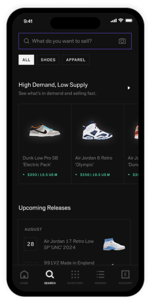
Search and Discovery Redesign
→

w
d
CONTACT
workudianne@gmail.com
SOCIAL
Knowledge Management for AI
Designing how enterprise teams define, share and govern the metrics, guides and key tables Summation's AI relies on.
Role
Lead product designer
Timeline
Jun - Sept 2026
Company
Summation
Gave enterprise teams a shared knowledge hub, so ~95% of AI report numbers are defined.

Overview
Challenge
- Knowledge was a loose folder of files, with no place for metrics at all.
- AI agents hallucinated or guessed definitions, so report numbers didn't match up.
Strategy
- Replaced per-team duplicates with one official metric projects can copy, modify and publish back.
- Designed for a state no one had planned: a company metric modified within a user’s project.
- Simple language for finance analysts, SQL one click deeper for data admins.
Impact
- 5 enterprise customers reused 50+ company metrics across 10+ projects.
- ~95% of report numbers trace to a defined metric, within 2 clicks of its source.
- 152 new workspaces in 2 weeks after launch; nearly 200 monthly active users.

Product Strategy & Insights
The Starting Point
Knowledge was buried in a folder of files
Knowledge is the AI's company handbook: metrics, guides and key tables. It lived in loose files with no place for metrics, so when a report said "Net Demand was $4.2M," no one could see or fix it.
Before
Target Users
Built for the data admin and the finance analyst
Data admins write the SQL behind each metric; finance analysts just want to check a number. After watching an analyst hit a wall of SQL, I put plain language first and SQL one click deeper.
Competitive Research
Few good references existed, so I tested against real data
AI knowledge tools were new ground. I studied Databricks, Snowflake, Looker, Hex and others, then stress-tested layouts with real customer data, which led to tags and a list that scales.
Scope Creep
Three parts planned, two shipped
We started with metrics, the numbers customers dispute most. When a human-approval step was cut for resources, I kept a metric activity log and let teams publish directly to move faster.
How I Worked
Explore with AI, decide in Figma, ship in code
I used Claude Code to spin up lo-fi options before committing in Figma, reviewed every round with leadership within days, and shipped 7 front-end PRs myself through launch.
Design Process & Decisions
Key Decision #1
From team "domains" to one shared source of truth
My early mockups organized knowledge by department. Leaders pushed back since metrics would duplicate across teams, so we landed on one official version per metric that projects can copy and adapt.
Early concept: knowledge grouped by domains, so every team kept its own copy of the same metric.


Shipped: one list of company metrics, each labeled with where it comes from (global, modified from global, or net new from project).
Key Decision #2
Make metrics & guides distinct, but consistent
Metrics and guides needed to feel distinct. I explored bolder layouts, like a dense code-style list and a wide table, but we chose consistency; standard list with metric names in a code font.
Explored: dense lists and wide tables
Shipped: standard list, metrics names in a code style font.
Key Decision #3
Give project knowledge a home that scales
I explored two things. Entry point: a simple nav button beat a sidebar widget, keeping AI context apart from true settings. Container: a full page with a left side nav beat a large modal and top tabs, with room for tables and skills.
Explored: Knowledge settings within a modal surface
Chosen path: Full page for a bigger workspace
Key Decision #4
Make knowledge impossible to miss
Two days before launch, leadership flagged that Knowledge was hard to discover. I framed three navigation options with clear trade-offs, aligned the team on a center navigation and built it before launch.
Various explorations to make knowledge more discoverable: top navigation, top-right button, and pills
Final Design
One place to define, adapt and share what the AI knows
Knowledge now sits beside project files, showing which metrics and guides are Global, Project or Modified. After bug bashes, I moved metric editing to a full page linked to its key table, built with Claude Code from our components.


Outcomes
- 5 enterprise customers reused 50+ company-wide metrics across 10+ projects.
- About 95% of report numbers come from a defined metric, each 2 clicks or fewer from its source.
- Shipped in the September launch: 152 new workspaces in 2 weeks, nearly 200 monthly active users.
- 7 front-end PRs shipped myself, from code prototype to launch-week fixes.
Reflections
A concrete wrong answer moves the team faster
My domain mockups didn't ship, but they got the strategy conversation moving. Putting something real in front of leadership early is more efficient than waiting for a finished brief.
What I'd do next
Next I'd build endorsement, where the AI drafts metrics and a person approves them, plus signals that show when knowledge changes, and conversational editing through the AI.
Other Projects

ML Powered Search Tool
→


Search and Discovery Redesign
→

w
d
CONTACT
workudianne@gmail.com
SOCIAL