Fulfillment InternalTool Redesign
Improving accuracy and onboarding in high-throughput warehouse workflows
Role
Product Designer
Timeline
Mar 2021 – Sep 2021
Company
GOAT Group, Fulfillment Team


Fulfillment Internal Tool
Designed an internal verification tool to reduce errors, speed up QC, and support onboarding in a high-volume warehouse environment.

Overview
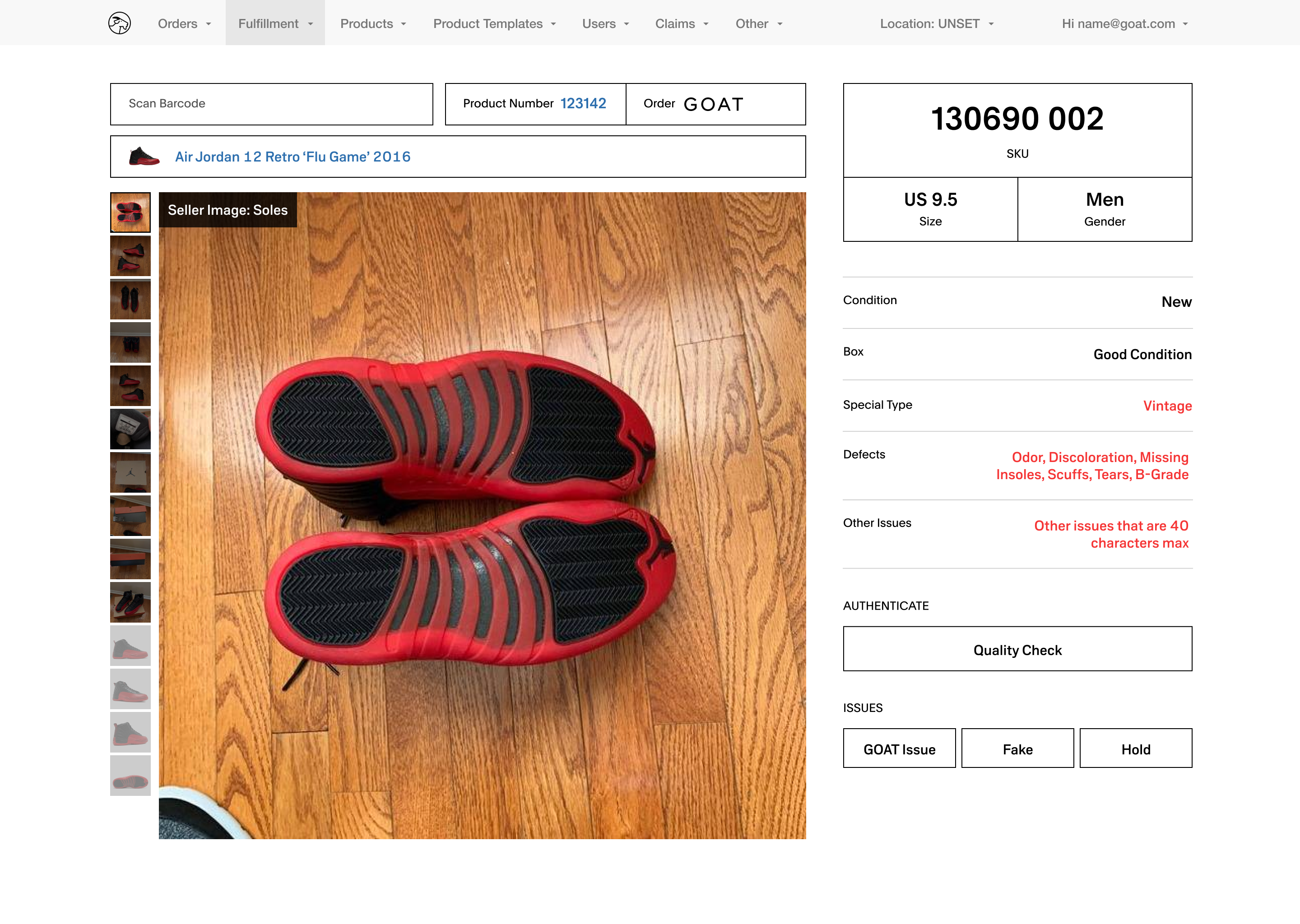
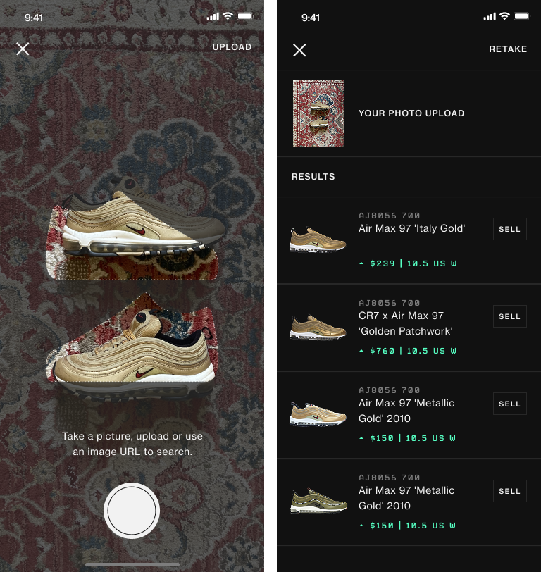
Existing internal tool dashboard: cluttered layout, inconsistent helper text, and unclear scan states contributed to verification errors and training challenges.
Challenge
- High error cost, unclear workflows, and steep onboarding curves
Strategy
- Conducted onsite field research and think-aloud sessions to understand real-world workflows and constraints.
- Clarified role-based flows and permissions to reduce cognitive load across experience levels.
- Redesigned hierarchy, error states, and visual emphasis to improve accuracy while preserving familiar interaction patterns.
Impact
- Reduced verification errors by improving SKU visibility, hierarchy, and issue clarity.
- Improved QC accuracy by keeping photos and issues persistently visible during verification.
- Streamlined onboarding with more consistent workflows while maintaining speed for experienced staff.

Research & Insights
Onsite Field Research
Designed for real-world conditions
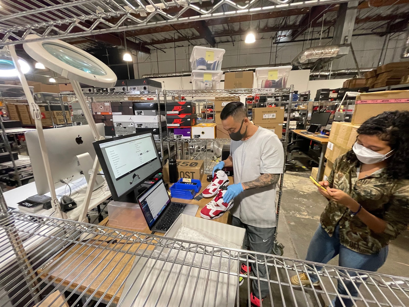
Observed warehouse QC workflows and ran think-aloud sessions with staff using scan guns. Identified key issues: unclear scan states, inconsistent helper text, and unhelpful error messages for new hires.
Role & Flow Analysis
Clarified permissions and responsibilities across staff levels
Analyzed workflows by experience level and mapped logic to uncover bottlenecks, training gaps, and cognitive load. Used insights to guide role-aware UI improvements.
Mapped staff roles and permissions across the verification dashboard to identify access and responsibility differences.
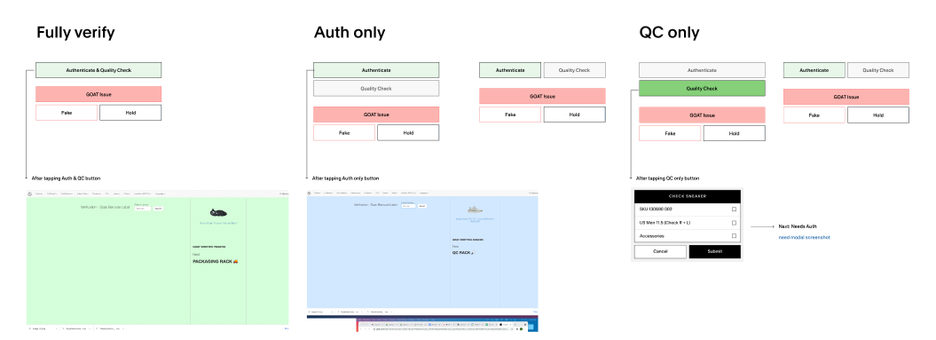
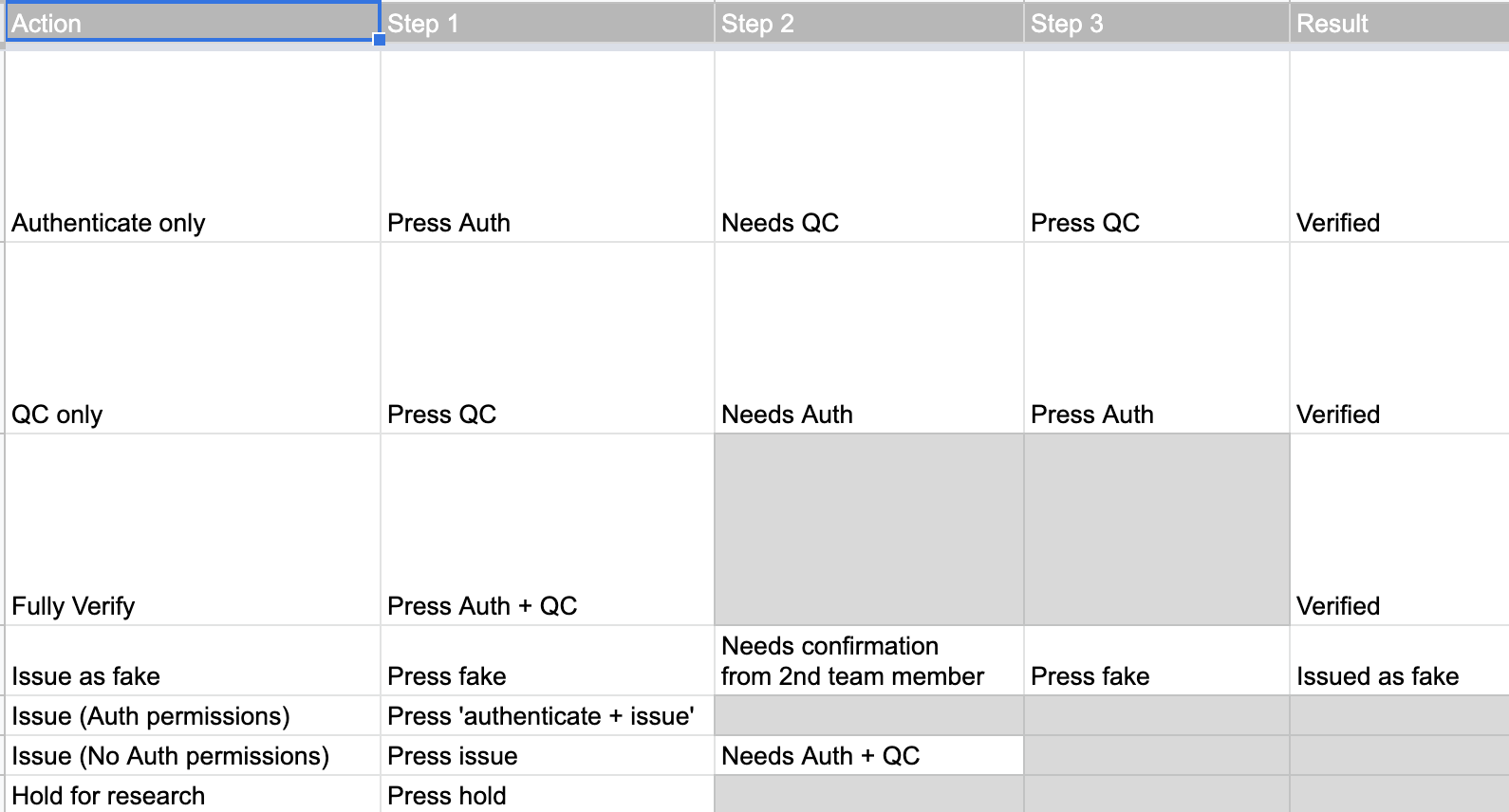
Visualized button logic for each role to clarify which actions are visible and when, revealing training gaps.
Layout & Competitive Research
Optimized for speed, scanning, and accuracy
Reviewed the previous design handoff to understand existing constraints and familiarity requirements.
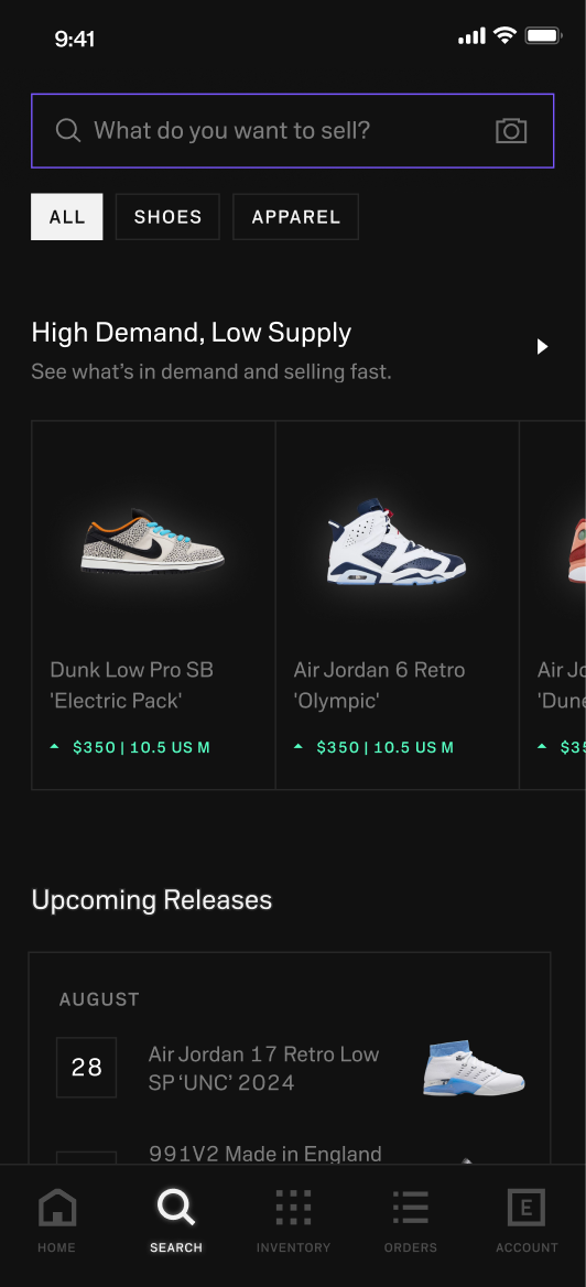
Studied image-heavy UI patterns to improve hierarchy, photo usage, and scannability in a dense interface.
Analyzing the existing internal tool dashboard to identify pain points, content hierarchy issues, and opportunities for improved scannability.
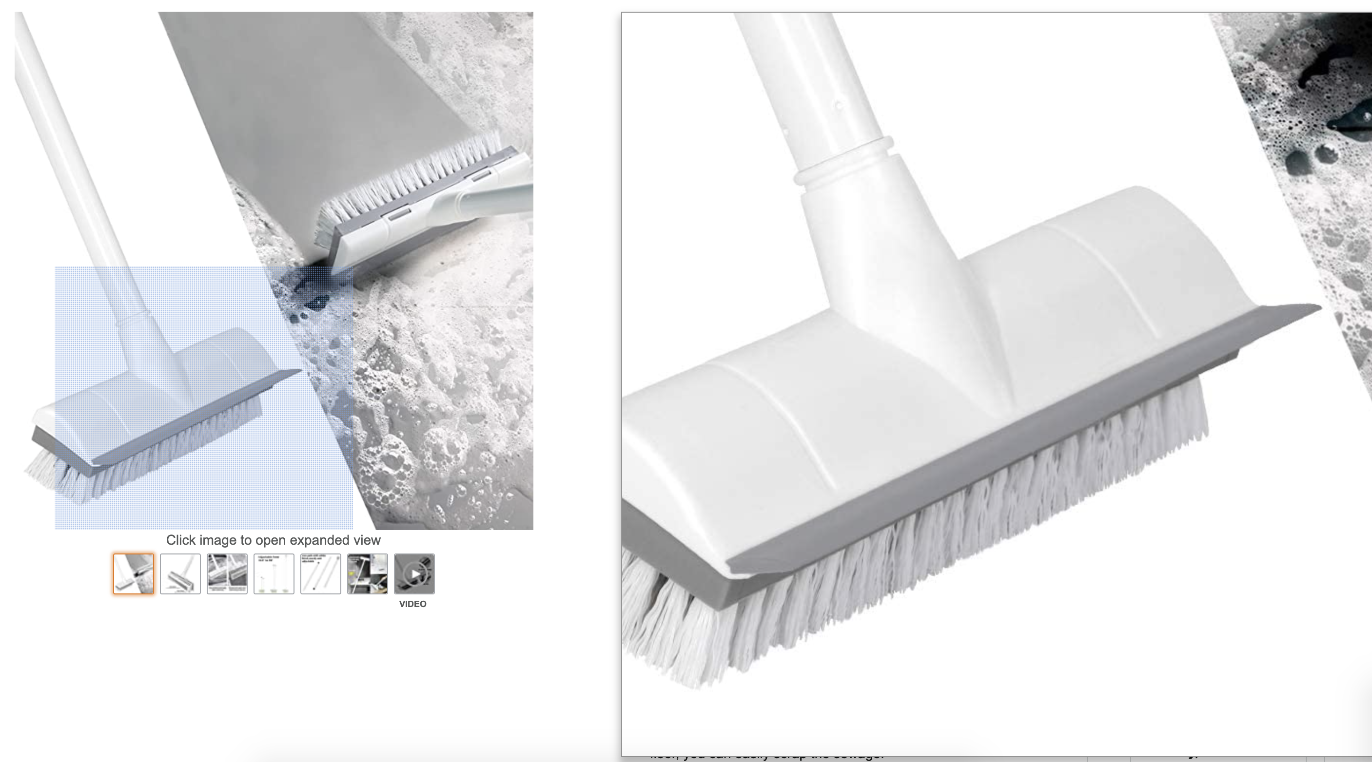
Studied hover-zoom behavior in e-commerce to improve product photo clarity and usability.
Design Process & Decisions
Key Action #1
Tested clarity vs. familiarity to minimize operational risk
Created four initial directions exploring different balances between training support and muscle memory. Narrowed to two directions for validation with warehouse staff.
Direction 1 emphasized restructured hierarchy and labeled photo panels to support trainees but introduced larger layout changes.
Direction 2 preserved the existing structure while improving scannability through larger SKUs, clearer grouping, and subtle visual adjustments.
Key Action #2
Optimized around real pain points surfaced in testing
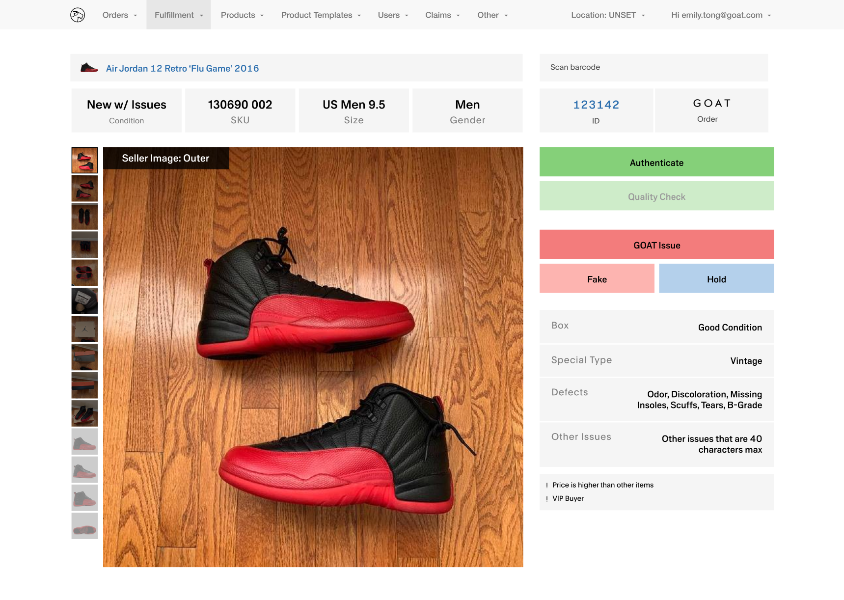
Internal focus groups highlighted SKU and size accuracy as the main challenge for new hires. Iterated on the UI by emphasizing SKU digits, defaulting to key images, and added safeguards like confirmation states and grace periods to minimize costly errors.


Fulfillment Internal Tool
Authentication blocked for entry-level staff, and failsafe option to correct mistakes.
Final Design
Delivered clarity without disrupting speed
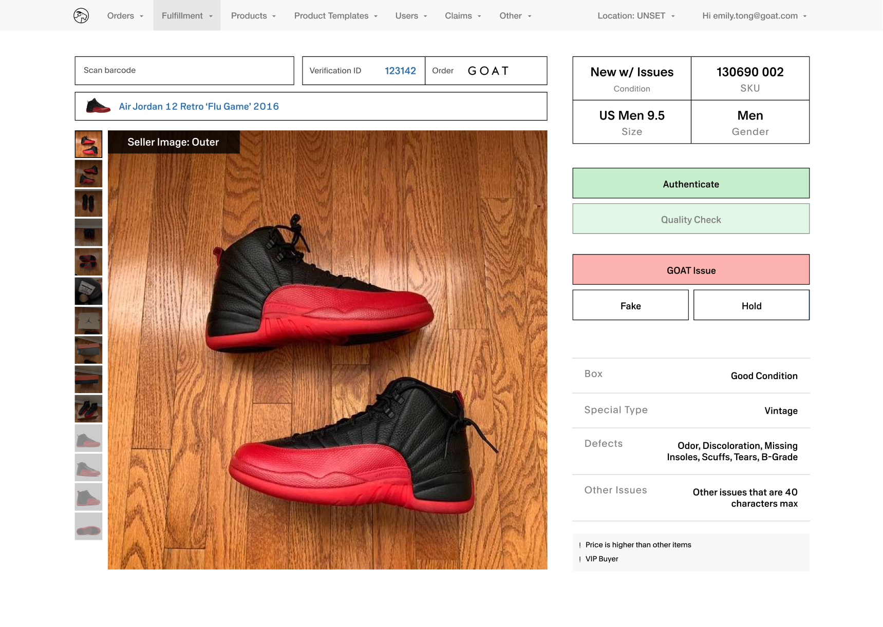
Simplified CTAs with dynamic copy and clarified success and error states.
Updated hierarchy to prioritize product number over internal IDs.
Partnered with warehouse leaders and copy to ensure language matched real workflows and responsibilities.


Fulfillment Internal Tool
Outcomes
- Reduced verification errors by enlarging SKUs and restructuring hierarchy.
- Increased QC accuracy by keeping issues and photos visible at all times.
- Improved onboarding by creating clearer, role-consistent workflows.
- Maintained familiarity to protect speed and minimize retraining.
Reflections
Designing for operations changed how I think about UX
This project taught me how to design for humans working under pressure, where clarity and error prevention matter more than aesthetics. Field research directly shaped decisions, turning real-world workflows into meaningful improvements. If revisiting this today, I’d further explore lighter visual treatments to improve scanning efficiency even more.
Other Projects


ML Powered Search Tool
→


Search and Discovery Redesign
→

w
d
CONTACT
workudianne@gmail.com
SOCIAL
Fulfillment InternalTool Redesign
Improving accuracy and onboarding in high-throughput warehouse workflows
Role
Product Designer
Timeline
Mar 2021 – Sep 2021
Company
GOAT Group, Fulfillment Team


Fulfillment Internal Tool
Designed an internal verification tool to reduce errors, speed up QC, and support onboarding in a high-volume warehouse environment.

Overview
Existing internal tool dashboard: cluttered layout, inconsistent helper text, and unclear scan states contributed to verification errors and training challenges.
Challenge
- High error cost, unclear workflows, and steep onboarding curves
Strategy
- Conducted onsite field research and think-aloud sessions to understand real-world workflows and constraints.
- Clarified role-based flows and permissions to reduce cognitive load across experience levels.
- Redesigned hierarchy, error states, and visual emphasis to improve accuracy while preserving familiar interaction patterns.
Impact
- Reduced verification errors by improving SKU visibility, hierarchy, and issue clarity.
- Improved QC accuracy by keeping photos and issues persistently visible during verification.
- Streamlined onboarding with more consistent workflows while maintaining speed for experienced staff.

Research & Insights
Onsite Field Research
Designed for real-world conditions
Observed warehouse QC workflows and ran think-aloud sessions with staff using scan guns. Identified key issues: unclear scan states, inconsistent helper text, and unhelpful error messages for new hires.
Role & Flow Analysis
Clarified permissions and responsibilities across staff levels
Analyzed workflows by experience level and mapped logic to uncover bottlenecks, training gaps, and cognitive load. Used insights to guide role-aware UI improvements.
Mapped staff roles and permissions across the verification dashboard to identify access and responsibility differences.
Visualized button logic for each role to clarify which actions are visible and when, revealing training gaps.
Layout & Competitive Research
Optimized for speed, scanning, and accuracy
Reviewed the previous design handoff to understand existing constraints and familiarity requirements. Studied image-heavy UI patterns to improve hierarchy, photo usage, and scannability in a dense interface.
Analyzing the existing internal tool dashboard to identify pain points, content hierarchy issues, and opportunities for improved scannability.
Studied hover-zoom behavior in e-commerce to improve product photo clarity and usability.

Design Process & Decisions
Key Action #1
Tested clarity vs. familiarity to minimize operational risk
Created four initial directions exploring different balances between training support and muscle memory. Narrowed to two directions for validation with warehouse staff.
Direction 1 emphasized restructured hierarchy and labeled photo panels to support trainees but introduced larger layout changes.
Direction 2 preserved the existing structure while improving scannability through larger SKUs, clearer grouping, and subtle visual adjustments.
Key Action #2
Optimized around real pain points surfaced in testing
Internal focus groups highlighted SKU and size accuracy as the main challenge for new hires. Iterated on the UI by emphasizing SKU digits, defaulting to key images, and added safeguards like confirmation states and grace periods to minimize costly errors.


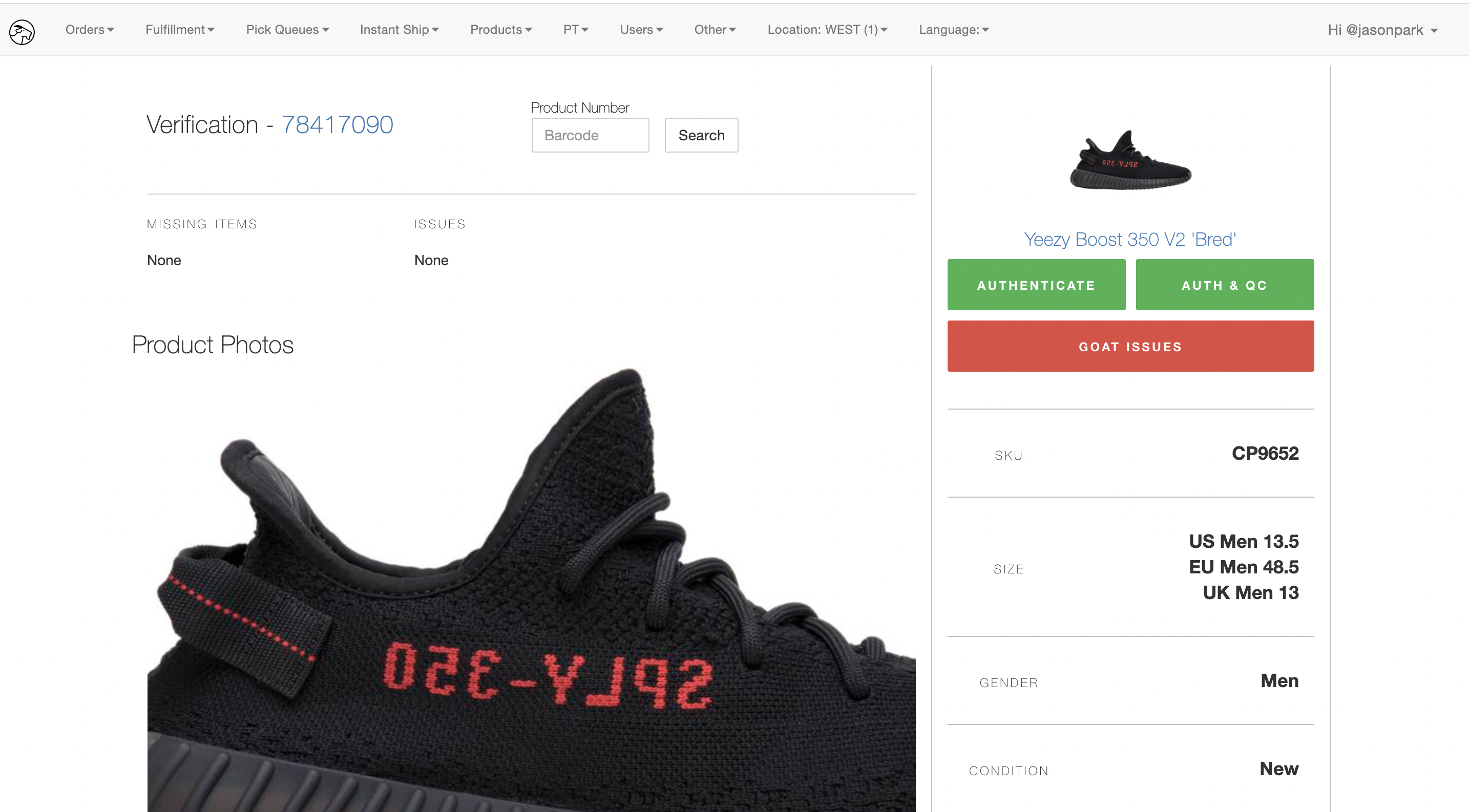
Fulfillment Internal Tool
Authentication blocked for entry-level staff, and failsafe option to correct mistakes.
Final Design
Delivered clarity without disrupting speed
Simplified CTAs with dynamic copy and clarified success and error states.
Updated hierarchy to prioritize product number over internal IDs.
Partnered with warehouse leaders and copy to ensure language matched real workflows and responsibilities.


Fulfillment Internal Tool
Outcomes
- Reduced verification errors by enlarging SKUs and restructuring hierarchy.
- Increased QC accuracy by keeping issues and photos visible at all times.
- Improved onboarding by creating clearer, role-consistent workflows.
- Maintained familiarity to protect speed and minimize retraining.
Reflections
Designing for operations changed how I think about UX
This project taught me how to design for humans working under pressure, where clarity and error prevention matter more than aesthetics. Field research directly shaped decisions, turning real-world workflows into meaningful improvements. If revisiting this today, I’d further explore lighter visual treatments to improve scanning efficiency even more.
Other Projects

ML Powered Search Tool
→
Search and Discovery Redesign
→

w
d
CONTACT
workudianne@gmail.com
SOCIAL
Fulfillment InternalTool Redesign
Improving accuracy and onboarding in high-throughput warehouse workflows
Role
Product Designer
Timeline
Mar 2021 – Sep 2021
Company
GOAT Group, Fulfillment Team


Fulfillment Internal Tool
Designed an internal verification tool to reduce errors, speed up QC, and support onboarding in a high-volume warehouse environment.

Overview
Existing internal tool dashboard: cluttered layout, inconsistent helper text, and unclear scan states contributed to verification errors and training challenges.
Challenge
- High error cost, unclear workflows, and steep onboarding curves
Strategy
- Conducted onsite field research and think-aloud sessions to understand real-world workflows and constraints.
- Clarified role-based flows and permissions to reduce cognitive load across experience levels.
- Redesigned hierarchy, error states, and visual emphasis to improve accuracy while preserving familiar interaction patterns.
Impact
- Reduced verification errors by improving SKU visibility, hierarchy, and issue clarity.
- Improved QC accuracy by keeping photos and issues persistently visible during verification.
- Streamlined onboarding with more consistent workflows while maintaining speed for experienced staff.

Research & Insights
Onsite Field Research
Designed for real-world conditions
Observed warehouse QC workflows and ran think-aloud sessions with staff using scan guns. Identified key issues: unclear scan states, inconsistent helper text, and unhelpful error messages for new hires.
Role & Flow Analysis
Clarified permissions and responsibilities across staff levels
Analyzed workflows by experience level and mapped logic to uncover bottlenecks, training gaps, and cognitive load. Used insights to guide role-aware UI improvements.
Mapped staff roles and permissions across the verification dashboard to identify access and responsibility differences.
Visualized button logic for each role to clarify which actions are visible and when, revealing training gaps.
Layout & Competitive Research
Optimized for speed, scanning, and accuracy
Reviewed the previous design handoff to understand existing constraints and familiarity requirements. Studied image-heavy UI patterns to improve hierarchy, photo usage, and scannability in a dense interface.
Analyzing the existing internal tool dashboard to identify pain points, content hierarchy issues, and opportunities for improved scannability.
Studied hover-zoom behavior in e-commerce to improve product photo clarity and usability.
Design Process & Decisions
Key Action #1
Tested clarity vs. familiarity to minimize operational risk
Created four initial directions exploring different balances between training support and muscle memory. Narrowed to two directions for validation with warehouse staff.
Direction 1 emphasized restructured hierarchy and labeled photo panels to support trainees but introduced larger layout changes.
Direction 2 preserved the existing structure while improving scannability through larger SKUs, clearer grouping, and subtle visual adjustments.
Key Action #2
Optimized around real pain points surfaced in testing
Internal focus groups highlighted SKU and size accuracy as the main challenge for new hires. Iterated on the UI by emphasizing SKU digits, defaulting to key images, and added safeguards like confirmation states and grace periods to minimize costly errors.


Fulfillment Internal Tool
Authentication blocked for entry-level staff, and failsafe option to correct mistakes.
Final Design
Delivered clarity without disrupting speed
Simplified CTAs with dynamic copy and clarified success and error states.
Updated hierarchy to prioritize product number over internal IDs.
Partnered with warehouse leaders and copy to ensure language matched real workflows and responsibilities.


Fulfillment Internal Tool
Outcomes
- Reduced verification errors by enlarging SKUs and restructuring hierarchy.
- Increased QC accuracy by keeping issues and photos visible at all times.
- Improved onboarding by creating clearer, role-consistent workflows.
- Maintained familiarity to protect speed and minimize retraining.
Reflections
Designing for operations changed how I think about UX
This project taught me how to design for humans working under pressure, where clarity and error prevention matter more than aesthetics. Field research directly shaped decisions, turning real-world workflows into meaningful improvements. If revisiting this today, I’d further explore lighter visual treatments to improve scanning efficiency even more.
Other Projects

ML Powered Search Tool
→


Search and Discovery Redesign
→

w
d
CONTACT
workudianne@gmail.com
SOCIAL